Settings
The Tear Sheets settings control how the plugin generates the PDFs for printing or sharing.
Where to find the settings
Go to WooCommerce → Settings → Tear Sheets.
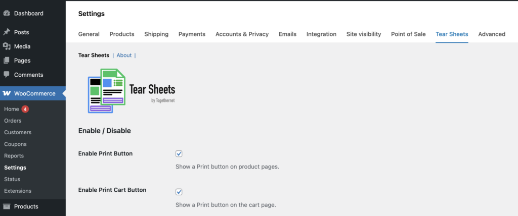
This opens the main settings area for the plugin. The settings are logically grouped into sections.
Enable / Disable
- Enable Print Button: show or hide the button or icon on product pages
- Enable Print Cart Button: show or hide the button or icon on the cart page
- Show in Mini Cart: add the button or icon to supported mini-cart layouts
- Button Visibility: by default, the button or icon is visible to all visitors. The Button Visibility setting lets you restrict this if your store has different requirements.Everyone — The button or icon is shown to all visitors, including guests. This is the default and suits most stores where tear sheets are intended as a customer-facing feature.
Logged-in users only — The button or icon is hidden from guests and only shown to visitors who are signed in to an account. Useful if you want to encourage account registration, or if your store sells to trade customers who must log in to view pricing.
Store managers and above — The button or icon is hidden from all customers and only visible to users with the Shop Manager or Administrator role. Use this if you want tear sheets to be a staff-only tool — for example, to generate product sheets for use in a showroom or sales meeting, without exposing the feature to the public.
Button Settings
- Icon: select the printer icon you want to use. Icons 2 and 3 on the row are designed to work against dark backgrounds only. The others will work on a mix of backgrounds.
- Custom Icon: upload a custom icon if you prefer to use your own artwork. The recommended height is 64px; accepted file formats include .png, .jpg and .svg. To revert to one of the default icons, clear this field, select a default icon and save the settings.
- Button Style: choose from displaying the icon or a button with text.
- Button Label: This controls the text shown on the text button and the accessible label used for the icon. Choose between Print and PDF.
- Product Page Button Position: choose where the Print button appears on the product page. Three positions are available: After Add to Cart (recommended for most themes), Product Summary, and Before Form. What works best depends on the theme you are using — experiment with the options if the default position does not look right.
- Priority: fine-tunes placement within the chosen position, to put the button before or after other elements that appear in the same area. Adjust this if the Print button overlaps or sits awkwardly next to another button.
- Cart Button Position: choose where the Print Cart button appears on the cart page. Next to Proceed to Checkout is recommended for most themes.
Header / Footer
- Header Image: the image shown at the top of the tear sheet. A wide, shallow-depth image works best.
- Footer Image: the image shown at the bottom of the tear sheet. Again, a wide but shallow image is ideal.
- Footer Content: WYSIWYG content shown above the footer image on product tear sheets. Use this to display your refunds policy, delivery options, terms and conditions, contact details, etc.
- Cart Footer Content: footer text for cart tear sheets. You might want to add the same information as in the footer content, or something similar.
Product Tear Sheet Content
Customise the content of the tear sheets by enabling or disabling the following product elements:
- header image
- title
- featured image
- gallery
- price
- short description
- full description
- product attributes
- SKU
- shipping information
- footer image
Additional product settings include:
- QR Code Position: left, right, or off. Adding a QR code makes it very easy to share the product details with others, to boost sales.
- Swap Long & Short Descriptions. You have the option to swap the positions of these descriptions on the product tear sheet, in order to achieve a better layout. A typical usage would be for a store that does not use short descriptions at all. Swapping will substitute the full descriptions in the short description position, i.e. near to the top of the page.
- Gallery > Max Images: You can limit the number of gallery images displayed.
- Gallery > Borders: Add a small border to the gallery images – especially useful if your images are on a very light background.
- Font Style: Select a style that best fits your brand.
- Paper Size: The tear sheets are designed to work best with either Letter or A4 paper formats. Either setting will work but choose the one your customers are most likely to employ.
- Strip Shortcodes: Enable this setting to remove any shortcode markup from descriptions before rendering, to keep the PDF clean.
Cart Tear Sheet Content
Cart tear sheets include dedicated settings for:
- header image
- footer image
- short description visibility: If you don’t need the product description on your cart tear sheets you can suppress it.
- short description truncation length: You can shorten the descriptions to just a few words to ensure there is space on the page for the full cart contents.
- cart footer content
QR codes can also be added to the cart tear sheet. This works in the same way as the product tear sheet QR code and is enabled and positioned via the same settings. The difference is that the embedded link will populate the user’s cart with the selected products.
Custom CSS
The ‘Custom CSS’ field lets you add your own print-specific styling to refine the final layout without editing the plugin code.
Next step
Next, see the Practical Tips guide to learn how to get the best out of Tear Sheets for WooCommerce.