Dashboard
The Pricing Analyser dashboard is the main working area of the plugin. It brings together product-level pricing signals, charts and recommendations so that you can review your catalogue and act on pricing opportunities in one place.
For most merchants, this is the screen they will return to most often.
Where to find it
Go to WooCommerce → Analytics → Pricing Analyser.
What the dashboard is for
The dashboard is designed to help you answer practical pricing questions such as:
- Which products may now justify a price rise?
- Which products may need a price reduction?
- Which products are attracting interest but not converting?
- Which products are trending strongly up or down?
- Which products are close to margin limits or pricing boundaries?
- Which recommendations are worth acting on now?
Rather than looking at separate reports and then updating products manually, you can review the relevant data and apply changes directly from the dashboard.
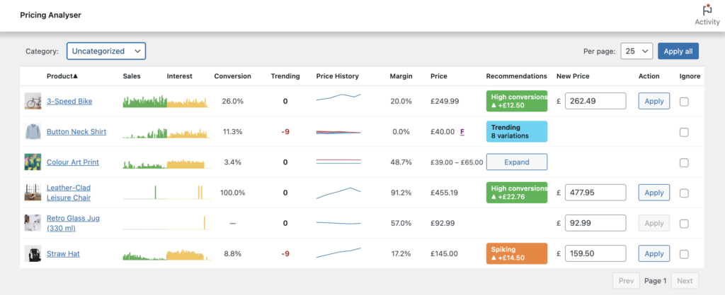
What the dashboard shows
Each row in the dashboard represents a product, and may include:
- product image and name – click to edit the product directly
- sales sparkline – click to open a more detailed sales chart
- interest sparkline – click to open a more detailed interest chart
- conversion rate
- trending score
- price history sparkline – click to open a more detailed price history chart
- margin percentage, where available
- current price
- recommendation chip
- suggested new price
- action button
- ignore option
Together, these give you a practical summary of recent product performance and the pricing action currently being suggested.
Most columns are sortable by clicking on the row headers.
Sales and Interest
The sales and interest columns show compact sparkline charts.
These help you quickly identify products that are:
- selling steadily
- accelerating
- slowing down
- attracting attention
- losing interest
You can click these charts to open a larger view and inspect the underlying pattern more closely.
Conversion
The conversion column shows the current conversion rate for the product.
This helps identify products that are receiving interest but not converting as strongly as expected. In practice, conversion is often most useful when read together with interest and sales rather than on its own.
Trending
The trending column shows a score from ‘-9’ to ‘+9’.
A positive score means the product’s recent sales are stronger than its earlier baseline. A negative score means recent sales are weaker than the earlier baseline. A score near zero means the recent pattern is broadly in line with what came before.
Trending is intended as a clear directional signal rather than a raw sales metric.
Price History
The price history sparkline shows how the product’s price has moved over time.
This is helpful when reviewing a recommendation because it shows whether the current price sits within a stable range or follows recent manual changes, sales or rule-based adjustments.
For variable products, the history view can reflect variation-level history where relevant.
Clicking the sparkline opens a detailed price history chart showing up to 30 price changes.
Margin
When margin display is enabled and a floor price is available, the dashboard can show a margin percentage.
This gives a quick indication of how much headroom exists between the current selling price and the floor price being used as a proxy for cost.
Margin visibility is particularly useful when reviewing reductions, sale recommendations and products that are drifting too close to the floor.
Current Price
The price column shows the current product price.
If a product is already on sale, the dashboard can show both the regular price and the sale price.
Boundary markers may also appear here to indicate floor or ceiling context. An underlined F indicates a price at or below the floor; similarly a C with an overline indicates a price at or above its ceiling.
This helps you understand the pricing state of the product before applying any recommendation.
Recommendation Chips
The recommendation chip is the most important output on the dashboard.
It shows:
- the matched rule
- the direction and size of the suggested price change
- whether the action would create a sale
- whether boundary conditions are relevant
- whether a recommendation is inactive or blocked
You can click the chip to open a detailed explanation of why the recommendation matched.
Some products may match more than one rule. In those cases, Pricing Analyser highlights the strongest recommendation while still allowing you to inspect other matched rules. Click on the chip to see all recommendations. Here you’ll also have the option to swap to one of the other recommendations.
Suggested New Price and Apply
The dashboard also shows the suggested new price, which you can edit before applying if needed.
From the same row, you can:
- apply the suggestion directly
- adjust the suggested value manually first
- ignore the product if you do not want it considered
This makes the dashboard both a review screen and an action screen.
Variable products
Variable products are handled carefully depending on how their pricing is structured.
Where variation-level treatment is needed, the product row can be expanded to reveal individual variations and their own pricing history, recommendation chips and actions.
This allows merchants to work at the right level of detail without overcrowding the main dashboard view.
Filters and controls
The dashboard includes controls to help you manage large catalogues, including:
- category filtering
- per-page display controls
- pagination
- apply-all support where appropriate
These controls make it easier to focus on one category or product group at a time.
Expanded Sales, Interest and Price History Charts
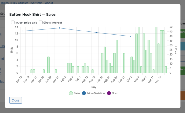
Click on any sparkline chart to open a more detailed view. For Sales and Interest, you can inspect data for the current window (either 30 or 60 days), overlayed with any relevant price history. You can invert the price history y-axis to make it easier to spot any correlation between the price changes and sales or interest. You might expect sales to follow the price trend after a small delay. If this is not the case, this indicates a lack of price sensitivity for a given product. That offers an opportunity to increase the price without detriment. On the other hand a close correlation suggests an opportunity to increase turnover with a small price reduction.
How to use the dashboard effectively
A practical approach is:
- filter to a category if needed
- look for recommendation chips first
- review the supporting sparklines and trend/conversion values
- open the explanation for any recommendation you may want to apply
- apply individually at first, then use broader actions once you are comfortable
The dashboard works best when used regularly, with a relatively small set of well-considered pricing rules.
Next step
Next, see the Pricing Rules guide to learn how recommendations are created.